Vital Farms
Brand Identity
PROBLEM
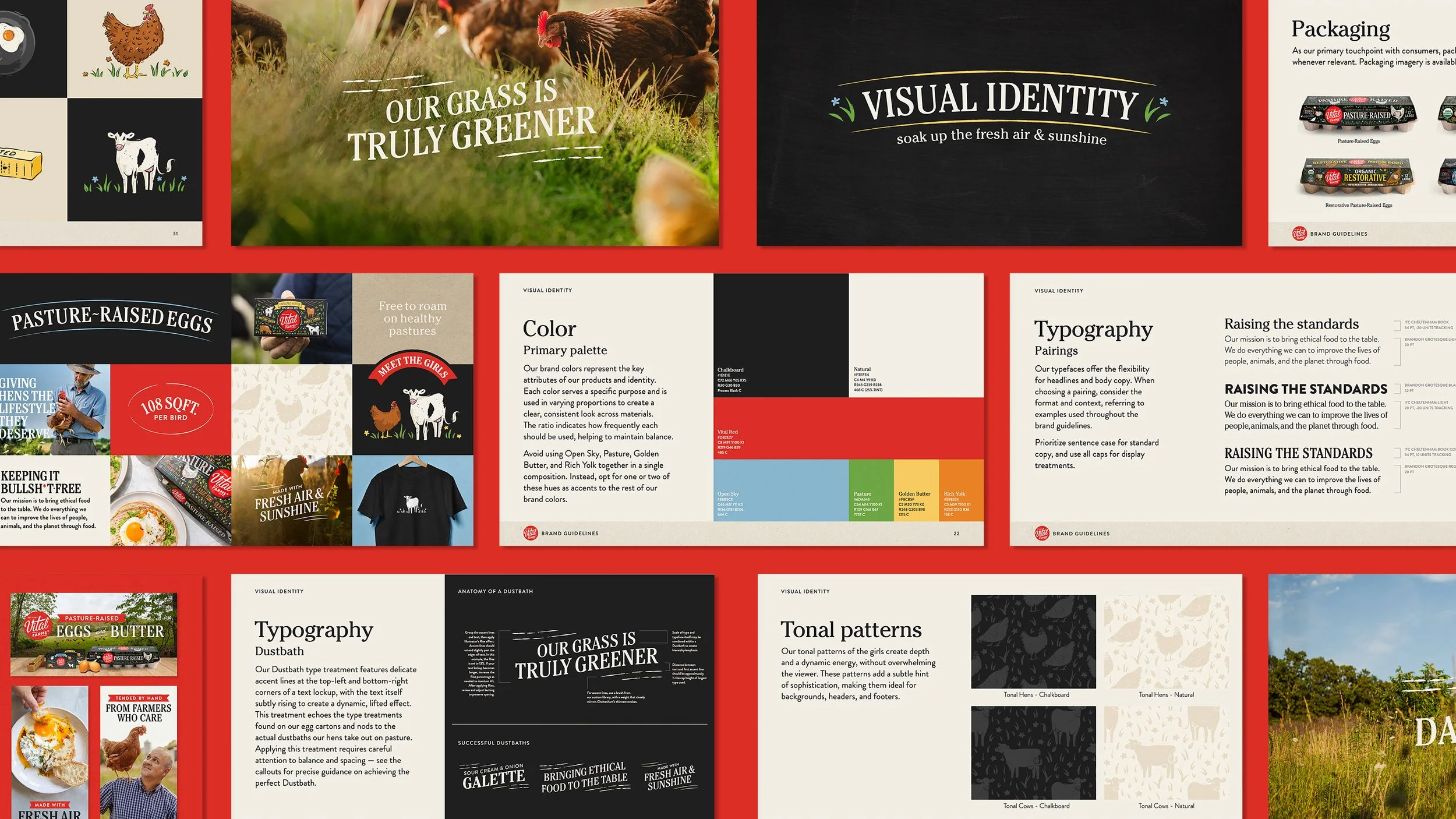
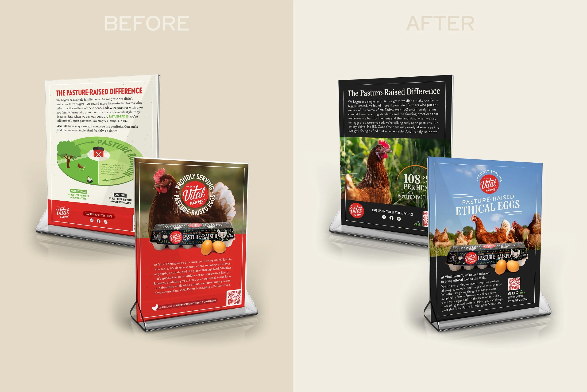
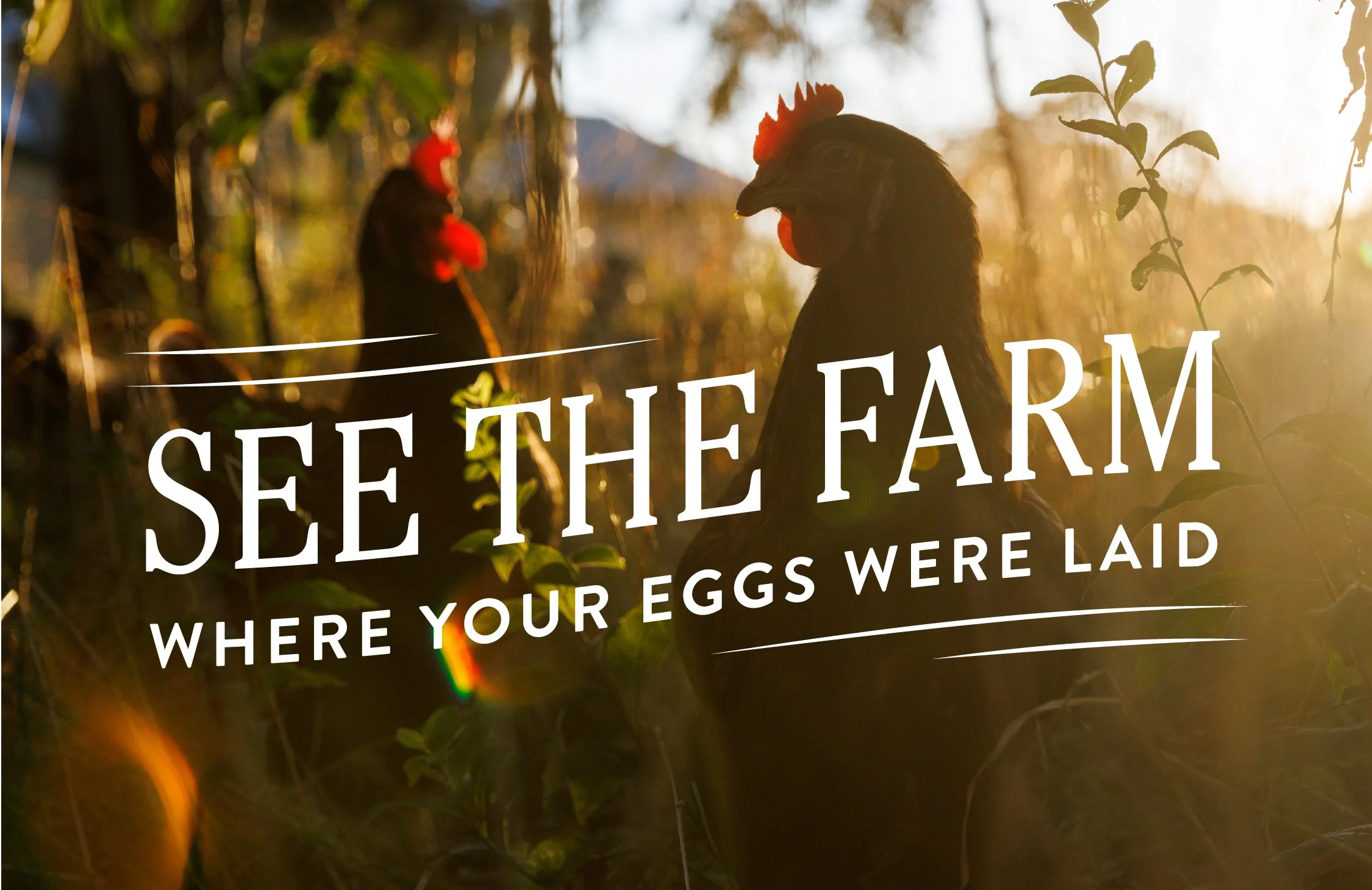
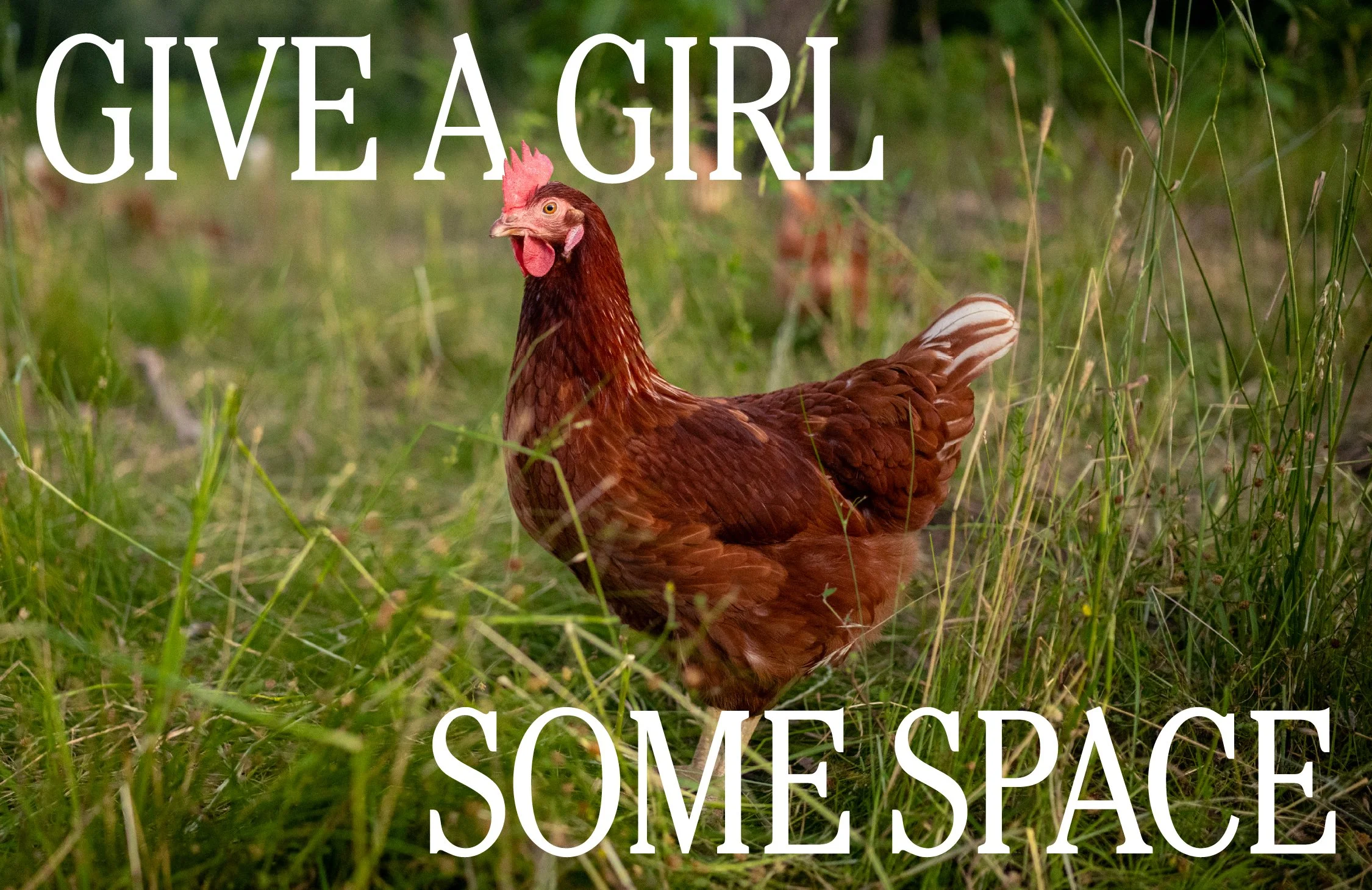
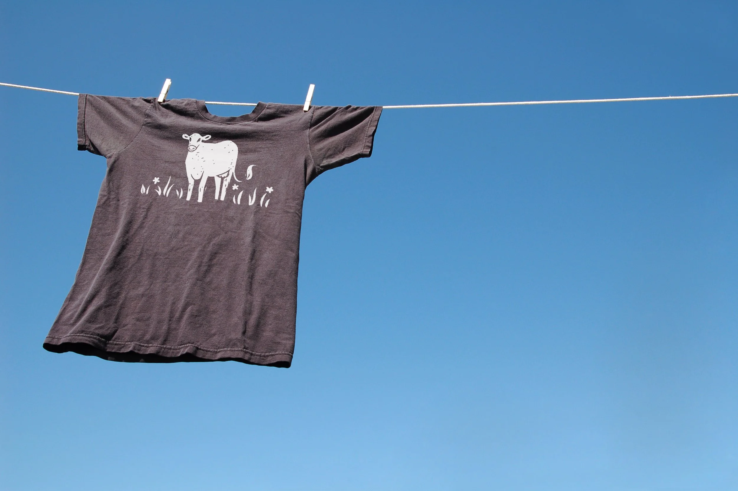
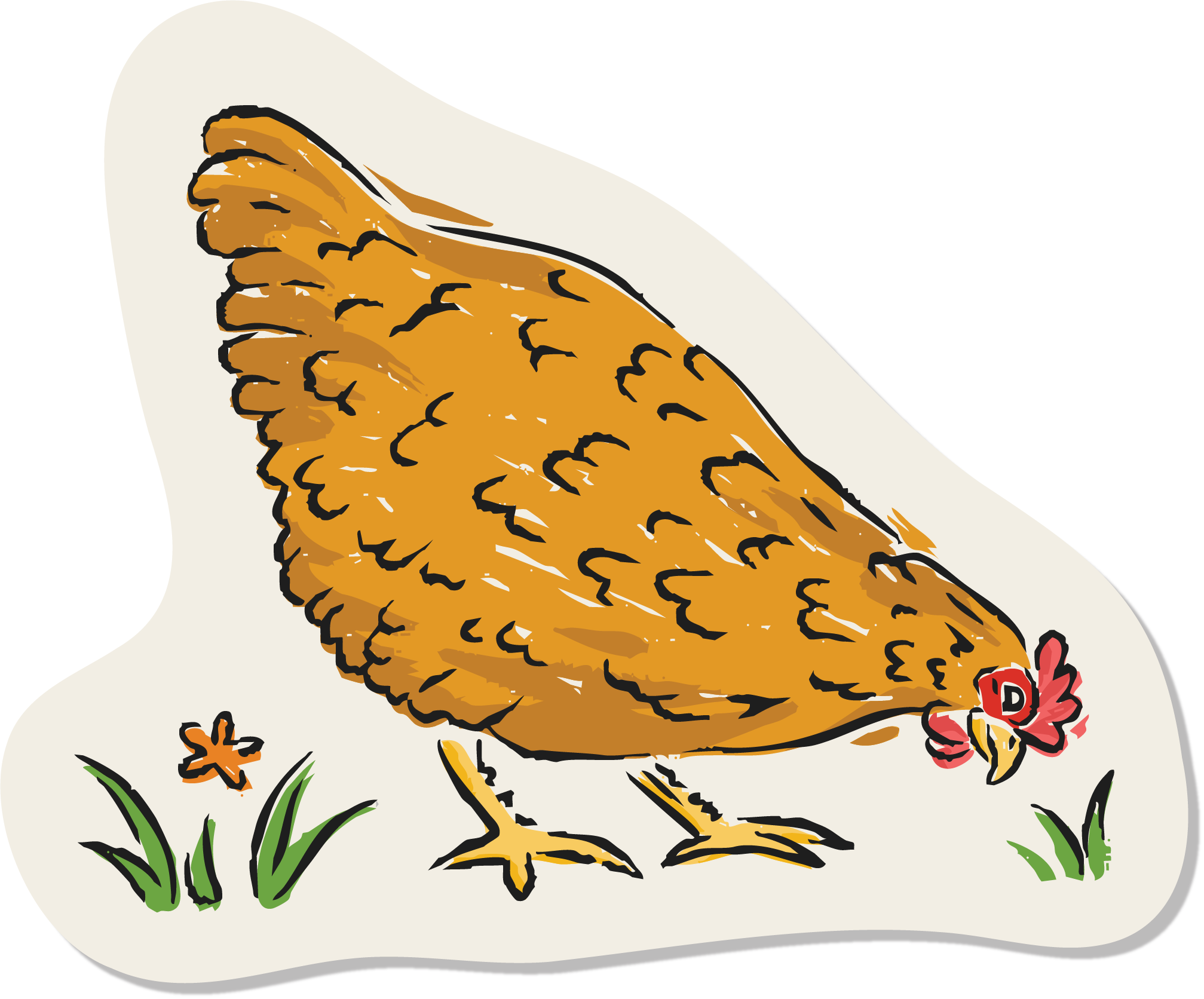
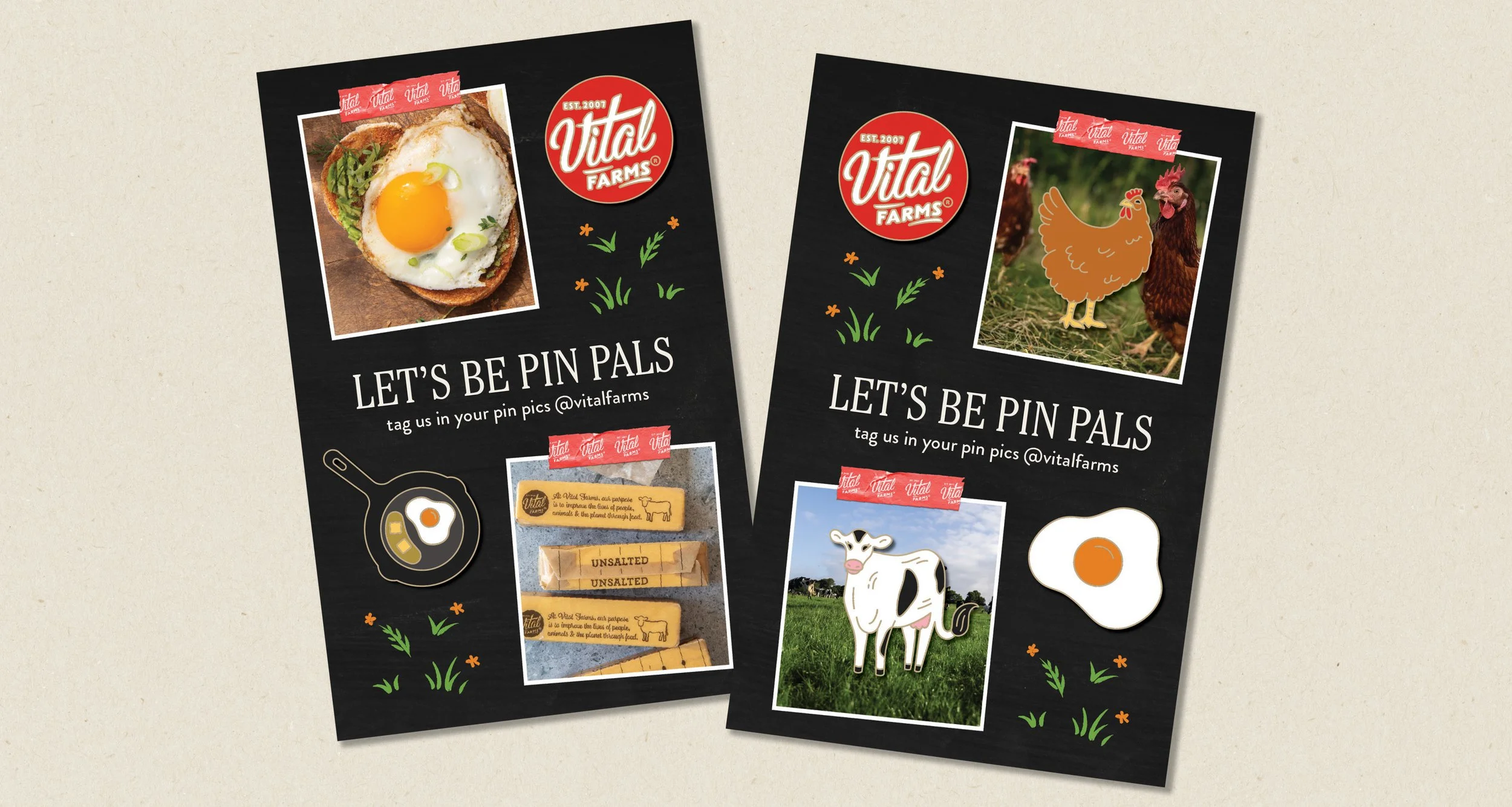
Vital Farms is best known for its recognizable packaging: black paper carton with hand-drawn type, chalk-sketched botanicals, and big red logo. They had outgrown their brand system that featured cartoon hens and cows, a playful typeface, and punchy colors. We needed to make a cohesive system that brough the equity of the pack beyond the shelf.
SOLUTION
Working with the other in-house designers, we iterated on the next evolution of the brand. We focused on three main elements that we applied across all touchpoints: typeface, illustration style, color palette.
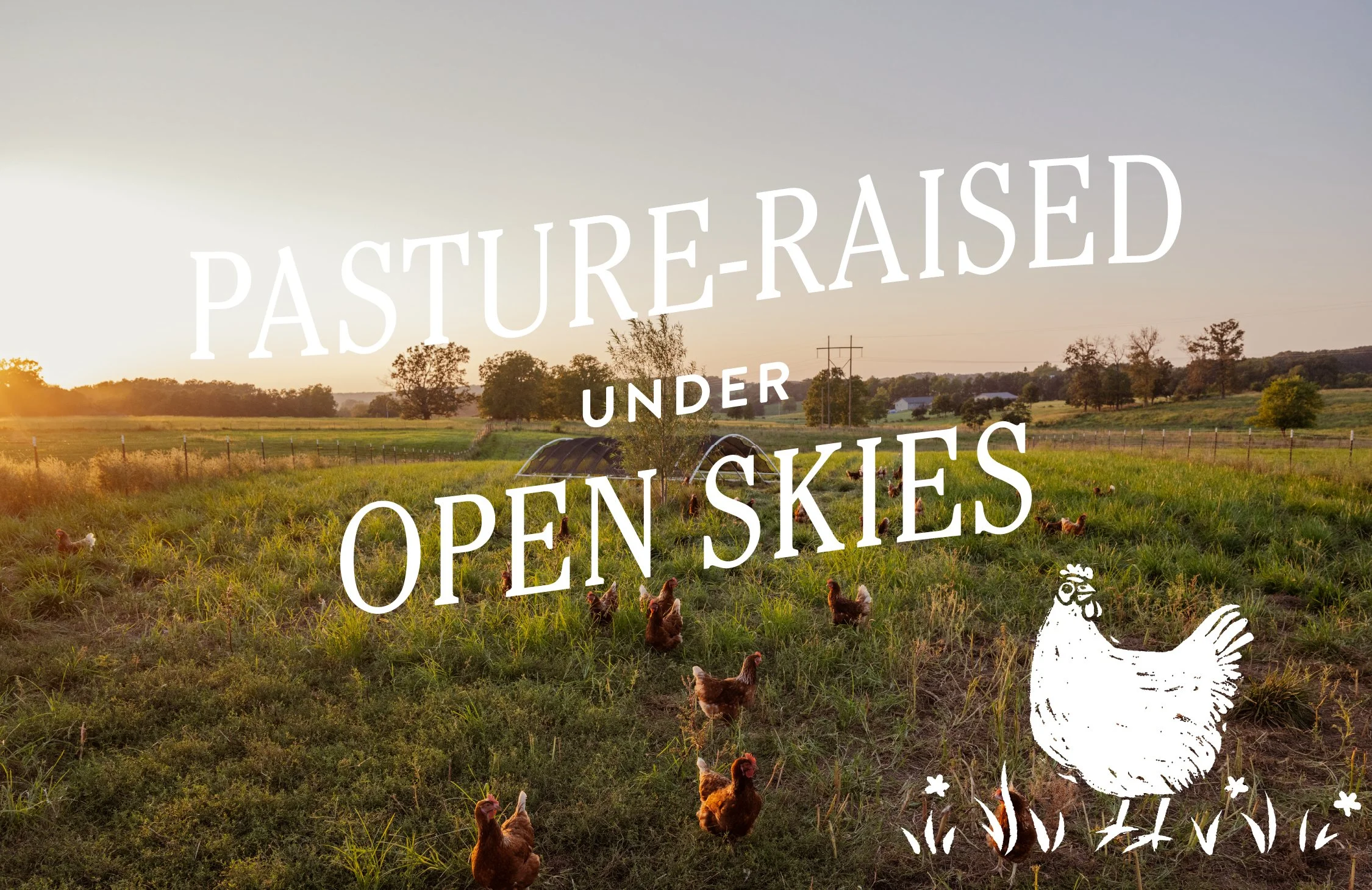
We chose Cheltenham for its timelessness and , while retaining Brandon Grotesque for body copy. The illustration style changed from vector cartoons to hand-drawn, chalk-inspired hens and cows that felt warm instead of sterile. We wanted a human element to be woven throughout the brand, as if all pieces were handcrafted. The color palette changed slightly to refelct colors found on the farms: open sky blue and pasture green.
TAKEAWAY
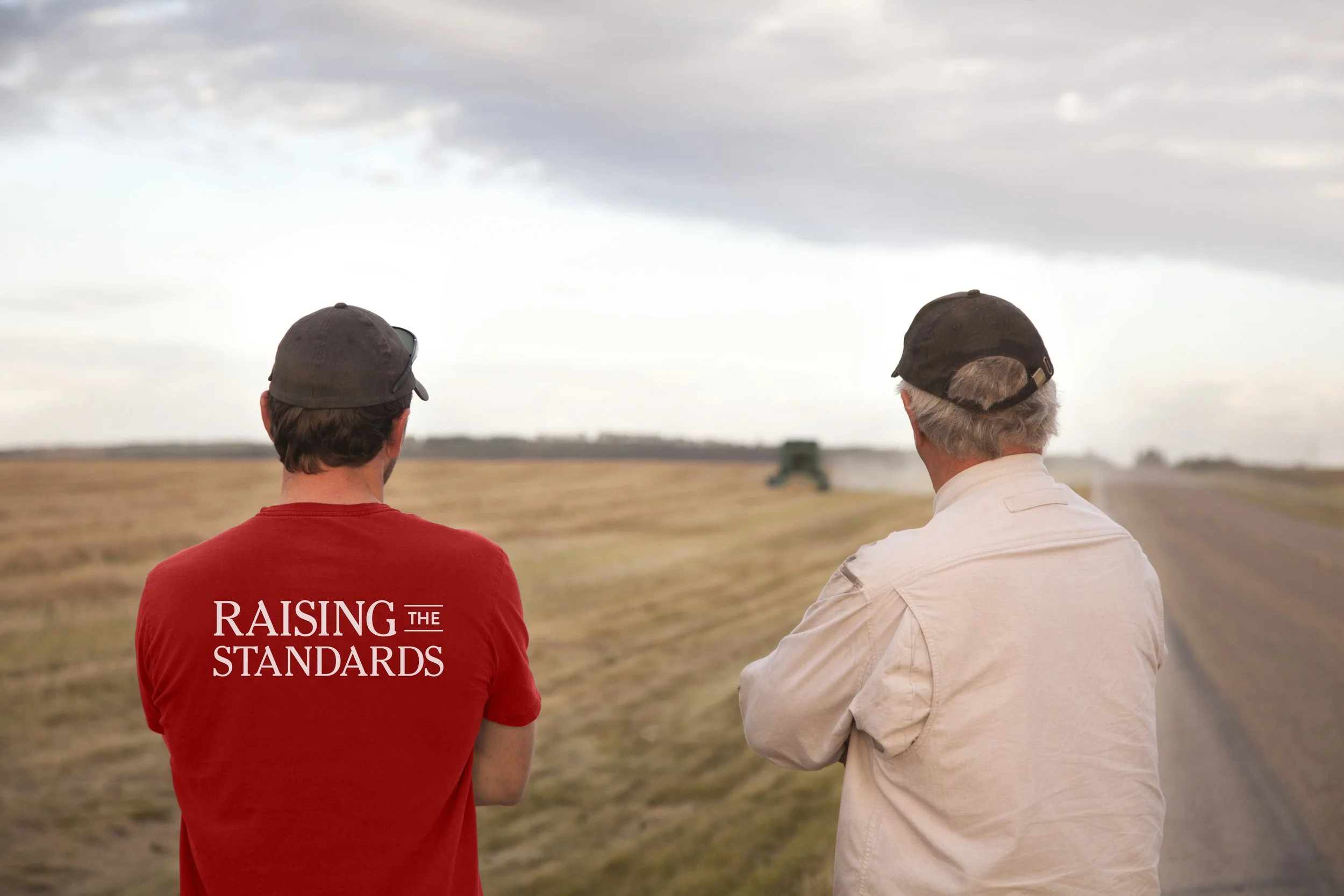
Consistency matters for consumers, and we were able to transform the brand to provide a consistent and recognizable experience, connecting the packaging to everything else.
Designers: Liv George, Olivia Noll, and Lauren Hanigan